


Section Layouts
Skill level: Beginner · Time: 1 minute per section
Many Givo sections can be drawn in more than one way. 15 sections, plus the page header, have 2 to 4 layouts each: 44 in all. You pick one with a single line, and the section keeps its copy:
options: layout: "overlay"No code changes: every layout of a section reads the same fields. A few layouts use an extra optional field (a photo, a cause id, a caption), shown as a comment in the section file or in the page file that uses it.
Where To Set A Layout
| Set it in… | It applies to… |
|---|---|
The section file, src/content/sections/<language>/<section>.md | Every page that shows the section without its own layout |
A page block, for example reviewsSection: in a page file | That page only |
Set it in every language folder. Without a layout value, a section uses the first value of its list in src/sections.schema.ts (for example photo for the hero, grid for the causes).
Copy the value from the comment next to layout: or from the catalog below. Section files have no schema, so npm run astro-check doesn’t report a misspelled value there: open the page to check it. In page blocks of files with a schema (for example src/content/homepage/english/home-appeal.md), astro-check reports a value that doesn’t exist.
Preview Every Layout: /elements/
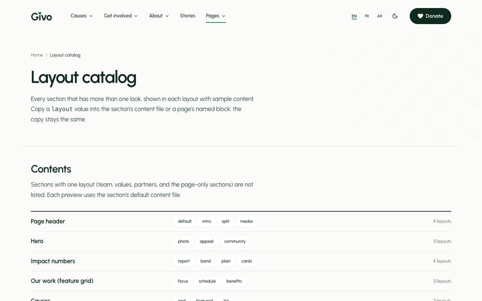
Run npm run dev and open http://localhost:4321/elements/. The page shows every section that has more than one layout, in each of its layouts, with the section’s default content, so you can compare looks before you choose. A list at the top jumps to each section, and each preview names the value to copy (options.layout). The page ends with the site header and footer layouts, each with a link to a page that uses it.
The gallery’s copy is in src/content/pages/english/elements.md (and each other language folder). The page is noindex, nofollow and left out of the sitemap. Before launch, keep it as a private reference or delete src/pages/[...lang]/elements.astro, the elements.md files, and the Elements link in the Pages menu of each src/config/menu.<language>.json.
Layout Catalog
The values come from the layoutOption([...]) lists in src/sections.schema.ts. The first value of each list is the one used when layout is empty. The page in brackets shows the layout in use.
Hero
File: hero-section.md · Block: heroSection
| Layout | What it looks like |
|---|---|
photo | The copy and a small donation widget beside one large photo (/) |
appeal | A forest block with the live total of one cause and quick amount chips, beside a large photo (/home-appeal/) |
community | Two path buttons and a rectangle photo, then the office hours, the next event, and how to find you (/home-community/) |
donate sets the widget of photo (its cause is passed on to the donate page). appeal reads one cause: appeal.cause is a file name in src/content/causes/, and its goal, amount raised, and newest update fill the panel. community reads the next event from src/content/events/ and the hours from [organization] in config.toml; its optional community fields are listed as a comment in the section file.
Impact Numbers
File: metrics-section.md · Block: metricsSection
| Layout | What it looks like |
|---|---|
report | A forest band with the numbers in one row and a source line |
band | A forest band with the intro beside the numbers |
plain | The band structure on the page background. Use it on a page that already has a forest band |
cards | Solid stat cards in green, forest, gold, and a light tint (/, /home-community/, /about/) |
Every number in the sample is a sample. Replace each one with your own.
Feature Grid
File: feature-grid-section.md · Blocks: featureGridSection, and involvedSection for the second grid on /
| Layout | What it looks like |
|---|---|
focus | Photo tiles (/) |
schedule | Ruled rows with hours and place per item (/home-community/, /fundraise/) |
benefits | The intro and a captioned image beside ruled rows (/volunteer/) |
Causes
File: causes-section.md · Block: causesSection
| Layout | What it looks like |
|---|---|
grid | Cause cards. With options.featured: true, the first featured cause is large and the next ones sit beside it (/) |
featured | One large featured card above a grid of the other causes (/causes/) |
list | Ruled rows, one per cause |
options.filter: true adds category chips above the cards (/causes/ turns it on). The goal, amount raised, donors, and days left come from each cause file. See Causes & Campaigns.
Supporter Voices
File: reviews-section.md · Block: reviewsSection
| Layout | What it looks like |
|---|---|
story | One quote beside a large photo on a full-width band (/) |
default | Three quote cards in a row, featured first (/home-community/) |
wall | A band of featured quotes, then a wall of quotes with role filter chips (/testimonials/) |
overlay | The first quote as a white card on a large photo, with the title above (/home-appeal/) |
story and overlay use image, imageAlt, and imageCaption. wall uses featured and chips. The quotes come from src/content/reviews/.
Where The Money Goes
File: gift-split-section.md · Block: giftSplitSection
| Layout | What it looks like |
|---|---|
split | The intro beside ruled rows, each with a share bar |
bar | The intro and links beside one stacked bar with a legend (/, /home-appeal/) |
Keep the percents adding up to 100, and equal to spend on the impact page. See Impact & Transparency.
Latest Stories
File: related-posts-section.md · Block: relatedPostsSection
| Layout | What it looks like |
|---|---|
default | Dated cards: date, category, and reading time (/blog/) |
news | The newest story large, beside dated rows (/) |
Upcoming Events
File: events-section.md · Block: eventsSection
| Layout | What it looks like |
|---|---|
list | Dated rows: a date column, the title, the time and place, and a Register button (/) |
agenda | Events grouped by month in compact rows, without photos (/home-community/) |
The events come from src/content/events/, and past events leave the list on their own. See Events & Calendar.
Give Now (Donation)
File: donate-section.md · Block: donateSection
| Layout | What it looks like |
|---|---|
default | The full donation form, with the impact receipt as the order summary (/donate/, /tribute/) |
quick | A teaser: the frequency toggle, preset amount chips, the receipt for the chosen amount, and a continue button that opens /donate/ |
The section file ships with layout: "quick"; /donate/ sets default in its own block. See Donation Form.
Giving Tiers
File: plans-section.md · Block: plansSection
| Layout | What it looks like |
|---|---|
default | One card per monthly tier (/donate/) |
compact | Ruled rows in one card (/home-community/) |
Without a plans list in the block, the tiers come from tiers in src/content/donate/<language>/-index.md. See Giving Tiers & Receipt.
Steps
File: steps-section.md · Block: stepsSection
| Layout | What it looks like |
|---|---|
default | A plain numbered list (/volunteer/, /fundraise/, /careers/) |
milestones | A dated list, with the year in each step’s meta (/about/) |
FAQ
File: questions-section.md · Block: questionsSection
| Layout | What it looks like |
|---|---|
default | The intro and a plain help note beside the question rows (most inner pages) |
stacked | One ruled band per group of questions |
grid | The intro over two columns of question rows (/home-appeal/) |
Volunteer Roles
File: volunteer-roles-section.md · Block: volunteerRolesSection
| Layout | What it looks like |
|---|---|
default | Columns split by rules, the time each role takes first |
list | Ruled rows: the role and skills, where, the time, and an Apply link (/volunteer/, /home-community/) |
The Apply link of list ticks the role in the volunteer form (?role=<id>). See Volunteer & Fundraise.
Contact
File: contact-section.md · Block: contactSection
| Layout | What it looks like |
|---|---|
default | The form card beside the office rows (/contact/) |
walkthrough | The intro and ruled rows beside the form card (/fundraise/) |
The address, phone, email, and hours come from [organization] in config.toml. See Organization Info.
Call To Action
File: call-to-action.md · Block: ctaSection
| Layout | What it looks like |
|---|---|
default | The copy and a button; with image, beside the photo (/causes/, /donate/, /faq/) |
volunteer | A forest band with a photo and two buttons (/about/, /team/, /home-community/) |
donate | A forest band with the live total of one cause (donate.cause) and amount chips (/home-appeal/, /impact/) |
newsletter | The copy beside the newsletter signup form, which posts to [settings.subscription] |
The call to action is off in the section file (enable: false). A page shows it with enable: true in its own ctaSection block; the main homepage leaves it off.
One Layout Only
These sections have one layout each, so /elements/ doesn’t list them: the appeal brief (split), appeal updates (timeline), partner logos (plain, file clients.md), values (plain), photo strip (strip), fundraisers (grid), toolkit (list), and default for the cause hero, event hero, event listing, story, open roles, team grid, contact options, volunteer form, blog list, newsletter, video, and not found sections.
Page Header
Inner pages open with a page header, set per page in a pageHeader block of the page file (there is no section file):
pageHeader: breadcrumb: true badge: label: "Get involved" icon: "HandHeart" tone: "green" # green | gold | amber | forest description: "Six ongoing roles at the community kitchen, ..." image: "/images/photos/<your-photo>.jpg" imageAlt: "What the photo shows" imageCaption: "Place · what is happening · Photo: credit" options: layout: "split" # default | intro | split | media| Layout | What it looks like |
|---|---|
default | The title and description. With image, a large rectangle photo under the copy, with its caption (most list pages) |
intro | Compact: the header of the legal pages |
split | The copy beside a 4:3 photo (/volunteer/, /fundraise/, /tribute/) |
media | The copy, then a large photo with its caption and a side panel beside it (cause and event pages) |
The title comes from the page’s title. The other fields are breadcrumb, eyebrow, badge (label, icon, tone; an empty label hides it), overlay (one small white card over the default or split photo), description, primaryButton, secondaryButton, buttons, badges, image, imageAlt, imageCaption, phone, and summary. options.compact: true gives another layout the intro height.
Header And Footer Layouts
The site header and footer have their own layouts, set in [settings.layout] of config.toml, or per page with headerLayout and footerLayout in the frontmatter:
[settings.layout] header = "default" # default | centered | utility footer = "default" # default | minimal | largeWhat The Homepages Use
The three homepages show most layouts in use. To reuse a look, copy the block (and any extra fields) from that homepage’s file in src/content/homepage/english/.
| Section | / | /home-appeal/ | /home-community/ |
|---|---|---|---|
| Hero | photo | appeal | community |
| Impact numbers | cards | – | cards |
| Feature grid | focus (twice) | – | schedule |
| Causes | grid (featured) | – | – |
| Supporter voices | story | overlay | default |
| Where the money goes | bar | bar | – |
| Latest stories | news | – | – |
| Events | list | – | agenda |
| Volunteer roles | – | – | list |
| Giving tiers | – | – | compact |
| FAQ | – | grid | – |
| Call to action | off | donate | volunteer |
| Other | partner logos | appeal brief, appeal updates, partner logos | photo strip, newsletter |
Do It With AI
Switch the [SECTION] section to the [LAYOUT] layout [everywhere | only on PAGE URL]. Check theallowed values in layoutOption([...]) in src/sections.schema.ts and the comment next to layout: insrc/content/sections/english/[FILE].md. If the layout uses extra fields, copy them from thepage file that already uses it. Change every language folder, then run npm run astro-check andtell me which page to open to check it.