


Navigation & Mega Menus
Files: src/config/menu.<language>.json · Skill level: Beginner
The header menu is built from one file per language. You write the links, and the theme draws the dropdowns, the flyouts, the Causes mega menu, and the mobile menu, with keyboard support. For the three header layouts and the Donate button, see Header. For the footer link columns, see Menus.
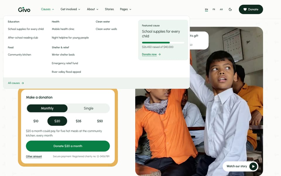
How The Menu Behaves
On large screens:
- All dropdowns and the mega menu share one floating panel. When you move from one menu to the next, the panel changes size and position instead of closing and opening again.
- A nested item opens a flyout beside its list, as deep as your data goes. A flyout that would run off the screen opens on the other side.
- Menus open on hover and on click.
On small screens the menu is a panel that slides in. Submenus open inside it, focus stays inside the panel while it is open, and Escape, the close button, or a click outside closes it.
Visitors who turn on reduce motion in their device settings get the menu without the movement. On Arabic pages everything mirrors: see RTL & Arabic.
The Menu File
There is one file for each language: src/config/menu.en.json, menu.fr.json, and menu.ar.json. The header menu is the headerPrimary list. The sample menu has five items: Causes (a mega menu), Get involved and About (dropdowns), Stories (a plain link to /blog/), and Pages (a dropdown that lists every page of the theme; set its "enable" to false in every file to hide it on your site).
There are three kinds of item.
1. A plain link
{ "enable": true, "name": "Stories", "weight": 4, "url": "/blog/" }2. A dropdown. Set "hasChildren": true and list the links in children. A child can have its own "hasChildren": true and children, which opens a flyout. The Pages menu uses this:
{ "enable": true, "name": "Get involved", "weight": 2, "hasChildren": true, "children": [ { "enable": true, "name": "Volunteer", "weight": 1, "url": "/volunteer/" }, { "enable": true, "name": "Fundraise", "weight": 2, "url": "/fundraise/" }, { "enable": true, "name": "Events", "weight": 3, "url": "/events/" } ]}An item with children opens its menu and has no link of its own. To link to the page it stands for, add it as the first child.
3. A mega menu. Set "hasMegaMenu": true and list groups of links in menus. The Causes menu has one group per cause category, a cta card beside the groups, and a bar row along the bottom:
{ "enable": true, "name": "Causes", "weight": 1, "hasMegaMenu": true, "menus": [ { "enable": true, "name": "Clean water", "weight": 3, "children": [ { "enable": true, "name": "Clean water wells", "description": "", "icon": "", "url": "/causes/clean-water-wells/", "weight": 1 } ] } ], "cta": { "enable": true, "eyebrow": "Featured cause", "cause": "school-supplies-for-every-child", "image": "", "title": "", "description": "", "items": [], "button": { "enable": true, "label": "Donate now", "url": "/donate/?cause=school-supplies-for-every-child" } }, "bar": { "enable": true, "text": "", "label": "All causes", "url": "/causes/" }}The Featured Cause Card
cta.cause takes the file name of a cause in src/content/causes/<language>/, without .md. The card then shows that cause’s title, its progress bar, and the “raised of goal” line, read from the cause file, so the figures stay in step with the cause page. A title you type in cta replaces the cause title. Change cause and the ?cause= in the button url together, so the button opens the donation form with that cause chosen.
Leave cause empty to build the card by hand from image, title, description, and items. Set "enable": false in cta to hide the card.
Menu Fields
| Field | Used on | What it does |
|---|---|---|
enable | Everything | true shows the item and false hides it |
name | Everything | The text shown |
weight | Everything | A position number. Keep it in step with the order in the file |
url | Links | /donate/ for your own pages (the language prefix is added for you), or a full https:// address |
hasChildren | Dropdowns, flyouts | true when the item has children |
children | Dropdowns, mega groups | The links inside. Items in a dropdown can have their own children |
hasMegaMenu | Top-level items | true when the item opens a mega menu |
menus | Mega menus | The groups of links. Each group has enable, name, weight, and children |
description | Mega menu links | A short line about the link (empty in the sample) |
icon | Mega menu links | A Lucide icon name (empty in the sample). See Icons & Images |
cta | Mega menus | The card: enable, eyebrow, cause, image, title, description, items, and button |
bar | Mega menus | The bottom row: enable, text, label, and url |
badge | Links | A small label or dot beside the name, with enable, type (dot or text), label, and color |
Keyboard Support
This works with no setup. Keep it working if you change the markup.
| Key | What it does |
|---|---|
Enter or Space | Opens the menu on the focused item |
Down and Up | Move through the links in the open list |
Left and Right | Move between top-level items, and in and out of flyouts |
Home and End | Jump to the first or last link |
Tab | Moves through the panel in reading order, and out of it at the end |
Escape | Closes the menu and returns focus to the item that opened it |
On Arabic pages Left and Right swap, so they follow the reading direction.
The menu components are in src/layouts/components/global/header/ (NavStage.astro for the shared desktop panel, NavStageMega.astro for the mega menu, DropdownMenu.astro and MegaMenu.astro for the mobile menu). The mobile panel is src/layouts/components/widgets/Offcanvas.astro.
Do It With AI
Add the cause "[CAUSE TITLE]" (file src/content/causes/english/[slug].md) to the Causes mega menuof my Givo site, in the "[CATEGORY]" group. Edit headerPrimary in every menu file in src/config/(menu.en.json, menu.fr.json, menu.ar.json), keep the same item shape, and translate the name foreach language. Don't change the navigation components. Then run npm run check-i18n andnpm run astro-check.