


Header & Mobile Action Bar
Files: src/config/config.toml, src/config/menu.<language>.json, src/i18n/<language>.json, src/content/sections/english/announcement-bar.md, page frontmatter · Skill level: Beginner
In the Tina edition, the menu is Menus and footer columns at /admin/, the layout and buttons are in Site settings > Settings, and the bar’s text is Announcement bar in Section defaults. In the Sanity edition, the menu is Menus > Header menu under your language in the Studio, the layout and buttons are in Site settings > Settings, and the bar’s text is Sections > Announcement bar.
Every header has the logo, the menu with its Services mega menu and its dropdowns, your phone number, the light/dark button, and one main button (“Get a price”). On phones the menu folds into a menu button, and a bar with Call and the main button sits at the bottom of the screen. Plumbo has four header layouts and an optional announcement bar above them.
Choose A Header Layout
[settings.layout] # default | simple | centered | utility header = "default"| Layout | What it looks like | Demo page |
|---|---|---|
default | A white bar: logo, menu, phone pill, light/dark button, and the orange pill button at the end. Used by the inner pages | /home-commercial/ |
simple | The same menu, phone, and a smaller button. Above a full-bleed hero photo (band or photo hero) it is transparent with white links, and turns solid once the page scrolls. On the main homepage it becomes three floating pills (logo, menu, phone and button) | / |
centered | A white pill-shaped bar that floats over the hero photo, with the menu in the middle. Over a full-bleed hero it is transparent with white links until the page scrolls, then the bar turns white and narrows | /home-residential/ |
utility | A slim orange strip with “Need a plumber today? Call us: (number)” above a white bar with the menu and one button. The phone pill moves into the strip | /home-water/ |
One page, another layout. Add headerLayout to the page’s frontmatter. It wins over [settings.layout] header:
---title: "Emergency plumbing"headerLayout: "utility" # default | simple | centered | utility---The homepages set their own this way (src/content/homepage/english/-index.md and home-*.md), and so does /elements/. A misspelled value is caught by npm run astro-check in files with a schema. The centered layout is meant for pages that open with a full-bleed hero photo, and simple turns transparent over one; see Homepages.
The utility strip’s text comes from utilityBar.help and utilityBar.callUs in src/i18n/<language>.json. The strip and the announcement bar scroll away; only the main bar stays pinned.
The Menu
The header menu is plain data: the headerPrimary list in src/config/menu.<language>.json. Plumbo ships six items, in this order: Services, Pricing, Areas, Commercial, Company, and Pages. Menus explains every kind of item, and Navigation explains how the menu behaves.
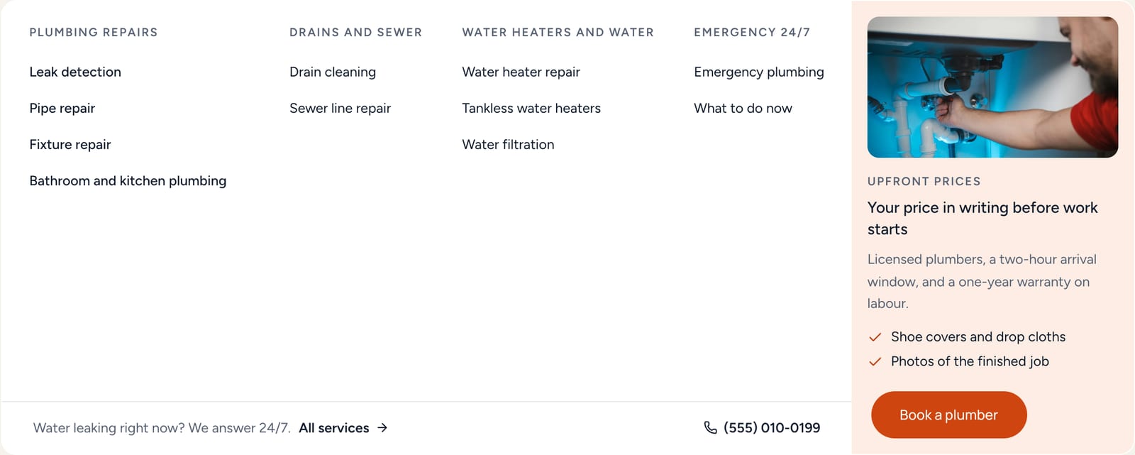
Services is a mega menu. It has four columns of links (Plumbing repairs, Drains and sewer, Water heaters and water, and Emergency 24/7), a photo card (“Your price in writing before work starts”) with a Book a plumber button, and a row along the bottom with a 24/7 line, All services, and your phone number. The column headings are plain text. You write these links yourself, so when you add a service, add its link here in every language.
Areas is a dropdown of your four sample areas, ending with All areas (4). When you add an area, add its link and update the count in the label, in every language. See Service Areas.
Pricing is a dropdown with prices, maintenance plans, specials and financing, and the instant estimate. Commercial lists the six sample sectors (the industries collection) and All sectors. Company is a dropdown, and Pages is a dropdown of the demo’s pages, with flyouts that open to the side.
On wide screens all dropdowns open in one panel under the header: hover or click an item, and move between items without the panel closing. The keyboard works too: Enter or Space on a menu item opens it, Tab moves through its links, and Esc closes it.
The Phone Pill
The round phone icon in the header calls [business] phone. From 1320 px wide it also shows phoneDisplay beside the icon. It is hidden when phone is empty, and the utility layout shows the number in its orange strip instead. On an area page with its own local number, the header uses that number. See Business Info.
The Main Button
[settings.navigationButton] enable = true label = "" # i18n `navigation.buttonLabel` ("Get a price"); a value here replaces it in every language url = "/book/" # Primary header button, hidden on this page itself; the mobile action bar uses the same buttonTo change the words, edit navigation.buttonLabel in each language file, such as src/i18n/en.json (“Get a price”) and src/i18n/fr.json (“Obtenir un prix”). The button is hidden on the page it links to, so /book/ doesn’t show a button to itself.
A different button on one page. A primaryCta block in the page’s frontmatter changes the header button, the phone action bar, the announcement link, and the footer link to the booking page, on that page only. The commercial homepage uses it to send every action to its site survey form:
primaryCta: label: "Book a survey" url: "#survey" # a section id on this page, or a path announcement: "hide" # link (swap the bar's booking link) | hide | keepA text link before the button. [settings.navigationSecondaryLink] adds a plain link (“Contact”) before the button in every header layout, from 1320 px wide. It ships off:
[settings.navigationSecondaryLink] enable = false label = "" # navigation.secondaryLabel ("Contact") url = "/contact/"Sticky Header
[settings] stickyHeader = true # Keeps the header pinned while scrolling (the announcement bar scrolls away)With true, the header stays at the top while you scroll, and a thin line appears under it once the page moves. false lets it scroll away with the page.
The Announcement Bar
A thin bar above the header for an offer or a notice, with one link and a close button. It ships off. Turn it on in src/content/sections/english/announcement-bar.md (and each other language folder):
---enable: false # Show the strip above the header on every pageid: "autumn-2026" # Change it when the message changes: visitors who closed the old one see the new onetext: "24/7 emergency plumbing: burst pipe or no water? Call **{phone}**, day or night." # Sample line: replace it or turn the bar off. Inline markdown and {phone} worklink: enable: true # One link, shown after the text label: "What to do first" url: "/emergency/"dismissible: true # Visitors can close it; the choice is kept in their browserstart: "" # Optional first day, YYYY-MM-DDend: "" # Optional last day, YYYY-MM-DD; also checked in the browser on old buildshideOn: ["/book/"] # Path prefixes where the bar stays hidden (no language prefix)tone: "ink" # ink | mist---tone:inkis a navy bar,mista light one.startandendshow the bar only between those dates.endis also checked in the visitor’s browser, so an old build doesn’t show an expired offer.- The text is a sample: replace it, or keep
enable: false.
The Mobile Menu
Below 1024 px wide, the menu links fold into a menu button (three lines) at the right of the header. It opens a full panel with:
- the menu items. Dropdowns and the mega menu open as lists inside the panel
- a Call button and the main button, side by side
- the language switch, with one link per language, and the light/dark button
The Mobile Action Bar
On phones (below 768 px), a bar is fixed to the bottom of the screen with Call and the main button, so a visitor can call or get a price from anywhere on the page.
[settings.mobileActionBar] enable = true showCall = true # Phone from [business] phone; hidden when it is empty showText = false # Text-message button; needs [business] sms hideOn = [ "/book/", "/contact/", ] # Path prefixes where the bar is not rendered (language prefix ignored) hideNearFooter = true # Slide away while the footer is visible- The main button is the header’s (
[settings.navigationButton], or the page’sprimaryCta). showText = trueadds a Text button that opens a text message to[business] sms. The bar then has three buttons.hideOnleaves the bar out on pages that already are the action."/book/"also covers/book/thanks/, and/fr/book/and/ar/book/in the other languages.- The bar also slides away while a form field has focus, and while the menu or a dialog is open. The cookie banner and the back-to-top button sit above it.
- The button labels are
mobileBar.callandmobileBar.textin the i18n files.
Files For Developers
In src/layouts/components/global/header/: Header.astro picks the layout and adds the announcement bar and the utility strip, SiteHeader.astro draws the bar, UtilityBar.astro is the orange strip, Navbar.astro, MenuItem.astro, and the NavStage files are the desktop menu and its shared panel, and DropdownMenu.astro and MegaMenu.astro are the submenus in the mobile menu. The mobile menu itself is widgets/Offcanvas.astro and widgets/HeaderOffcanvasContent.astro, and the announcement bar is widgets/AnnouncementBar.astro, under src/layouts/components/. The bottom bar is src/layouts/components/global/MobileActionBar.astro, and the styles are in src/styles/navigation.css.
Do It With AI
Set the header to the [default | simple | centered | utility] layout in [settings.layout] ofsrc/config/config.toml, and list the page files that set their own headerLayout. Change theheader button: url "[URL]" in [settings.navigationButton], and navigation.buttonLabel ineach file in src/i18n/ to "[LABEL]", translated. Keep the label short enough for the mobileaction bar.Turn on the announcement bar: in announcement-bar.md, in every language folder ofsrc/content/sections/, set enable: true, text "[TEXT]", the link "[LABEL]" to [URL], end "[YYYY-MM-DD]",and a new id. On phones, also show a Text button in the mobile action bar([settings.mobileActionBar] showText = true) with our text number [NUMBER] in [business] sms.