


Section Layouts
Skill level: Beginner · Time: 1 minute per section
Most Plumbo sections can be drawn in more than one way. The hero has eight looks, the services eleven, the reviews eight. You pick one with a single line, and the section keeps its copy:
options: layout: "carousel"No code changes: every layout of a section reads the same fields. A few layouts use an extra optional field (a row of photos, a list of logos), shown as a comment in the section file or in the homepage file that uses it.
Where To Set A Layout
| Set it in… | It applies to… |
|---|---|
The section file, src/content/sections/<language>/<section>.md | Every page that shows the section without its own layout |
A page block, for example reviewsSection: in a page file | That page only |
Set it in every language folder. Without a layout value, a section uses default (the logos use grid).
Copy the value from the comment next to layout: or from the catalog below. Section files have no schema, so npm run astro-check doesn’t report a misspelled value there: open the page to check it. In page blocks of files with a schema (for example homepage/english/home-water.md), astro-check reports a value that doesn’t exist.
Preview Every Layout: /elements/
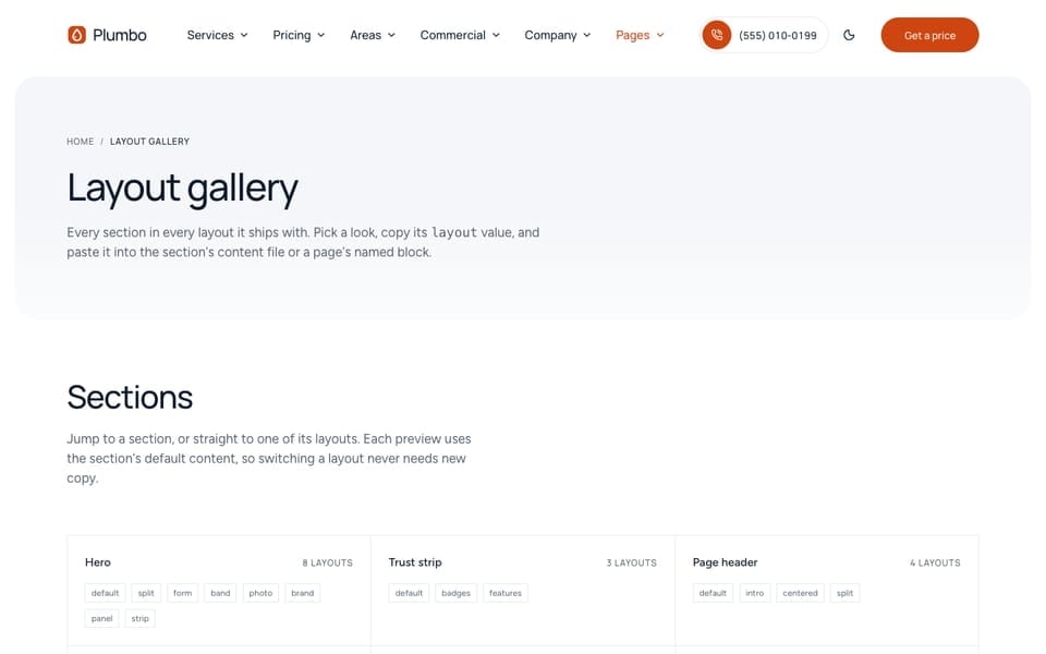
Open /elements/ on your site (http://localhost:4321/elements/ with npm run dev), or the demo gallery. It shows every section in every layout, with the section’s default content, so you can compare looks before you choose. A list at the top jumps to each section and each layout, and each preview names the value to copy. The page ends with the site header, footer, and page templates.
The gallery’s copy is in src/content/pages/english/elements.md (and each other language folder), including serviceEntries, the sample service shown for each service hero layout. The page is noindex and left out of the sitemap. Before launch, keep it as a private reference or delete src/pages/[...lang]/elements.astro, the elements.md files, and the Elements link in the Pages menu of each src/config/menu.<language>.json.
Layout Catalog
The values come from the layoutOption([...]) lists in src/sections.schema.ts. The first value of each section is its default. New marks the layouts made for the Plumbo homepages; the page in brackets shows it in use.
Hero
File: hero-section.md · Block: heroSection
| Layout | What it looks like |
|---|---|
default | A framed photo with a light card on one side (title, one line, two buttons, three check items), a price sticker, and the rating chip in a notch of the photo |
split | A tinted panel with the copy, a call pill, and the main button, beside a photo that runs to the page edge with a price card pinned to it |
form | A framed photo band with a white card over its lower part holding a short quote form |
band | A full-width photo under the header with the title in white on it, and an optional small photo card holding the main button |
photo | New (/home-residential/). A full-bleed photo under the floating header, an eyebrow pill, the title, an orange and a white call pill, and the rating |
brand | New (/home-water/). A navy brand block with one framed photo and a short call-back card |
panel | New (/home-commercial/). A grey panel with the copy, a framed photo, and a proof row |
strip | New (/). A centred big title and one pill, with a row of rounded photos below (photos, four read best) |
priceTag sets the sticker (default) and the price card (split); form holds the quote form fields; photos holds the photo row of strip. The photo hero pairs with the centered header, which stays transparent over the photo until you scroll.
Trust Strip
File: trust-strip.md · Block: trustStrip
| Layout | What it looks like |
|---|---|
default | A coloured rounded block: the rating as a big number with stars, then each fact beside its icon, split by thin dividers |
badges | A white card: the rating and each rating source on the first row, the facts on the second |
features | A band with three facts, each with an icon in a small square, a short title, and one or two lines. No rating |
Services
File: services-section.md · Block: servicesSection
| Layout | What it looks like |
|---|---|
default | Photo cards by trade, with the from-price of each |
list | Grouped rows with duration and price, under sticky trade pills (the /services/ page, and one flat list on /emergency/) |
trades | One trade at a time, with a tab per trade |
cards | Framed cards with tilted photos and a “Learn more” pill per trade |
columns | The intro split in two, then one column per service with an icon, split by thin lines |
overlay | Tall photo cards with the trade name on the photo, and a centred button |
checklist | A centred intro over a white card per service with check rows, then a guarantee card (customTile) |
photos | New (/home-residential/). 3×2 photo cards: photo, icon chip, title, text, and a quote link |
tiles | New (/home-water/). A sticky intro beside 2×2 photo tiles with the copy on the photo |
business | New (/home-commercial/). Outlined cards with a label and a short note heading (serviceNotes) |
chips | New (/). Photo cards with a tag chip and a “from” price chip |
The trades, services, and prices come from src/content/services/ and src/content/pricing/.
Steps
File: steps-section.md · Block: stepsSection
| Layout | What it looks like |
|---|---|
default | One colour block per step with a big number, the title, the text, and the meta line |
row | A light row of three to five steps with big numbers, on thin lines (/home-commercial/, /emergency/, /specials/) |
timeline | A sticky intro beside a schedule: a time column, a line with round nodes, and a photo per step |
illustrated | Circles with line drawings (illustration per step), joined by arrows |
staggered | Four cards that step down from left to right, each with a photo |
path | Steps placed right, left, right along a dashed winding line, with the button under it |
photos | New (/home-residential/). A grey panel with four steps and a photo for each |
cards | New (/). Plain cards with meta as the small step label (“Step 1”) |
Plans
File: plans-section.md · Block: plansSection
| Layout | What it looks like |
|---|---|
default | Plan cards. The maintenance plans on /pricing/ and the coupons on /specials/ use it, with a customPrice text on each card |
hourly | The trade rate sheet: rate, minimum, and note per service (ignores plans) |
table | Every plan and its prices in one table |
savings | Three tiles: the label and title in the middle, the first two recurring discounts beside it. It needs discounted frequencies in the pricing file, which the sample does not have |
duo | New (/). The first two plans side by side in one panel, with a small label above each price (priceLabel) |
A frequency toggle shows only when a plan is priced from a rate card with discounted frequencies. /pricing/ shows default and, under it, a second plans block (ratesSection) in the hourly layout. See Pricing & Estimator.
Add-Ons
File: add-ons-section.md · Block: addOnsSection
| Layout | What it looks like |
|---|---|
default | Tiles, four per row on desktop |
list | Two columns of rows with the prices on the right (the /pricing/ page) |
What’s Included
File: included-section.md · Block: includedSection
| Layout | What it looks like |
|---|---|
default | A table with one column per service and one row per task, grouped by part of the home (rooms in src/content/services/english/-index.md) |
rooms | One tab per part of the home |
Reviews
File: reviews-section.md · Block: reviewsSection
| Layout | What it looks like |
|---|---|
default | The rating summary beside a lead review, over a two-column grid |
marquee | A rating line, then rows of short reviews moving slowly in opposite directions (still, and scrollable, with reduced motion) |
wall | A ratings table, a featured band, and a review wall with service filter buttons (the /reviews/ page) |
summary | The rating and the ratings per source beside three reviews |
carousel | A tinted panel with two review cards in view, round arrows, dots, and a rating chip in a tab |
spotlight | A big counter and client logos, then one review at a time with a picker |
single | One big card at a time with a photo, the stars, and the quote, with round arrows |
band | A coloured block with a photo card (photos) and client logos, a rating tab, and review cards |
The reviews come from src/content/reviews/, filtered per page with filter (see Homepages), and the rating figures from trust-strip.md. spotlight and single show a photo per review only when you add photos in portraits; the sample uses photos of the work, never faces. See Reviews & Projects.
Service Areas
File: areas-section.md · Block: areasSection
| Layout | What it looks like |
|---|---|
default | Area pills and the ZIP code finder beside a neighbourhood photo |
list | The finder on a band, then one card per area with its ZIP codes and neighbourhoods (the /areas/ page) |
finder | The intro beside the finder panel and its “All areas” list |
tabs | One tab per area with its hours, address, phone, email, link, and photo |
chips | New (/home-residential/). Area pin chips, a help card (“Not sure we cover you?”), and a photo |
Call To Action
File: call-to-action.md · Block: ctaSection
| Layout | What it looks like |
|---|---|
default | With an image: the title, text, button, and phone beside a framed photo. Without one: a coloured block with the same copy |
split | An orange block with the copy on the left and a recap card with the buttons and phone on the right (ticket). Used on /home-commercial/ |
band | A full-width orange band with a label, title, text, call pill, button, and photo. The emergency band on /home-residential/ and /home-water/ |
newsletter | Copy beside the email signup form (falls back to default when [settings.subscription] enable = false) |
slanted | A navy block with the photo at the bottom, its top edge cut at a slant |
panel | New (/). A navy rounded panel with a centred title, a book pill, and a call pill |
The call to action ships off (enable: false in call-to-action.md). A page shows it with a ctaSection block that sets enable: true. See Footer & CTA Band.
FAQ
File: questions-section.md · Block: questionsSection
| Layout | What it looks like |
|---|---|
default | A sticky intro and call box beside the accordion. With group on the questions and groupNav: true, a topic index with counts and a search box (the /faq/ page) |
stacked | The intro across the top, then one band per group of questions |
card | A centred intro, then a side card beside the accordion |
grid | A centred intro over two columns of outlined questions |
Feature Rows
File: feature-grid-section.md · Block: featureGridSection
| Layout | What it looks like |
|---|---|
default | An icon grid, three or four columns (columns). The financing block on /specials/ |
alternating | One row per item, the text and photo swapping sides on every other row |
tabs | The item titles as tabs, with the active item’s text and photo beside them |
sticky | The intro and buttons stay in view while the items scroll past |
bento | Bordered cells of mixed widths, each with an optional photo |
showcase | A tall photo with a play button for video, and a second photo beside a coloured panel with two points |
split | A photo on one half and a navy panel with the title, points, and buttons on the other |
checks | Check rows split by thin lines beside a large rounded photo, with a years badge (the about block on /home-residential/) |
mission | New (/home-water/). A grey text card and a photo, then a moving strip of the list titles |
contract | New (/home-commercial/). The maintenance contract on the navy block |
Why Us
File: why-us-section.md · Block: whyUsSection
| Layout | What it looks like |
|---|---|
default | A photo collage beside the benefits |
story | A “who we are” panel over a coloured block with the benefit cards and the numbers from metrics-section.md |
collage | Two overlapping photos with a rotating circle of words, the opening hours, and a call button |
media | A tall photo beside the copy, two short points, and a button |
accordion | The copy, the benefits as rows that open, a button, and a photo |
bento | New (/home-residential/). An orange card, a tall photo with a stat card, and grey cards |
rows | New (/home-water/). A photo beside icon rows that open, the first one open |
Numbers
File: metrics-section.md · Block: metricsSection
| Layout | What it looks like |
|---|---|
default | Three or four big numbers with a label, counting up on scroll (/home-water/, /emergency/) |
box | The numbers in one box with thin dividers |
band | New (/home-residential/). One orange block over the lower edge of the full-bleed hero, with white numbers |
statement | New (/). The title as a large centred statement, with three figure cards |
Before/After And Recent Jobs
File: before-after-section.md · Block: beforeAfterSection
| Layout | What it looks like |
|---|---|
default | One large before/after slider (drag the line, or use the arrow keys) beside a project card with the service, area, and total |
grid | A grid of project cards, with optional trade filter buttons (filter) and a large featured card (featuredLarge) |
gallery | A masonry of job photos with a button. No sliders (the recent jobs on /home-residential/) |
Contact
File: contact-section.md · Block: contactSection
| Layout | What it looks like |
|---|---|
default | The open-now line, the phone as the headline, text, email, and office rows, the hours table, and the form (the /contact/ page) |
walkthrough | An intro and check rows (benefits) beside a form card, for commercial requests such as the site survey on /home-commercial/ |
quote | A form card beside a photo and a guarantee card (guarantee). Used on /home-residential/ |
Team
File: team-grid-section.md · Block: teamGridSection
| Layout | What it looks like |
|---|---|
default | Roster cards from src/content/team/ |
portraits | A centred intro, then photo cards with the name and role. A member without a photo gets a card without one |
row | New (/home-water/). Photo cards with a “since” chip on each photo (sinceLabel, where {year} is the member’s since) |
Logos
File: clients.md · Block: clientsSection
| Layout | What it looks like |
|---|---|
grid | Logos in a grid of 4 or 6 per row (columnsPerRow) |
plain | A borderless row of logos (/) |
Commercial Sectors
Block: industriesStrip (no section file; the items come from src/content/industries/)
| Layout | What it looks like |
|---|---|
default | One line of links to the sector pages (/services/, service pages) |
grid | Photo cards with an intro (/home-commercial/) |
Booking Request
File: booking-section.md · Block: bookingSection
| Layout | What it looks like |
|---|---|
default | The full five-step booking form (the /book/ page) |
card | A photo backdrop with a white card holding a photo, three numbers, and the first step. Continue opens /book/ with the choice |
Blog Teaser
File: related-posts-section.md · Block: relatedPostsSection
| Layout | What it looks like |
|---|---|
default | A lead post and rows |
side | The intro and link button beside two posts |
Service Page Hero
File: service-hero-section.md · Set in each service: options.layout in src/content/services/english/<service>.md
| Layout | What it looks like |
|---|---|
default | The service facts and a static price ticket |
estimate | The estimator in the hero, locked to this service (drain-cleaning uses it) |
repair | The hourly rate block and a job list ticket, with a “Send your list” button |
commercial | A site ticket and a request button, with no booking and no total |
This value is more than a look: it picks the whole template of the service page and its section order. See Services & What’s Included.
Sections With One Layout
These have layout: "default" only: instant estimate (estimate-section.md), about hero, story, values, careers band, open roles, guarantee claim, permits and certificates (compliance-section.md), contact options, not our job (not-covered-section.md), blog list, newsletter, and not found. The referral block has one layout too.
Page Header
Inner pages open with a page header, set per page in a pageHeader block of the page file (there is no section file):
pageHeader: breadcrumb: true eyebrow: "" description: "Short answers about prices, emergencies, the visit, and our warranty. Each one links to the detail." image: "/images/steps/inspect.jpg" # 4:3 photo on the right (`split`) options: layout: "split" # default | intro | centered | split| Layout | What it looks like |
|---|---|
default | The title and description on the left, short facts (the summary) on the right |
intro | Compact: the title and description on the left, the buttons or phone line on the right (the /book/ page) |
centered | One narrow centred column, the facts as one line |
split | The copy on the left and, on the right, a fact sheet: the ticket, else the image (with both, the ticket rows show as a card over the photo, as on /specials/) |
The title comes from the page’s title. The other fields are breadcrumb, eyebrow, description, primaryButton, secondaryButton, buttons, badges, phone (style: "line" or "button"), summary, ticket, image, and imageAlt. options.compact: true gives another layout the intro height.
Header And Footer Layouts
The site header and footer have their own layouts, set in [settings.layout] of config.toml, or per page with headerLayout and footerLayout in the frontmatter:
[settings.layout] header = "default" # default | simple | centered | utility footer = "default" # default | minimal | large | columnsSee Header & Mobile Bar and Footer & CTA Band.
What The Homepages Use
The four homepages are the best showcase of the layouts. To reuse a look, copy the block (and any extra fields) from that homepage’s file in src/content/homepage/english/.
| Section | / | /home-residential/ | /home-water/ | /home-commercial/ |
|---|---|---|---|---|
| Hero | strip | photo | brand | panel |
| Services | chips | photos | tiles | business |
| Steps | cards | photos | – | row |
| Why us | – | bento | rows | – |
| Numbers | statement | band | default | – |
| Feature rows | – | checks | mission | contract |
| Reviews | single | summary | marquee | carousel |
| Team | – | – | row | portraits |
| Contact | – | quote | – | walkthrough |
| FAQ | – | default | default | card |
| CTA | panel | band | band | split |
| Other | logos plain, plans duo | recent jobs gallery, areas chips | included default | sectors grid, permits default |
Do It With AI
Switch the [SECTION] section to the [LAYOUT] layout [everywhere | only on PAGE URL]. Check theallowed values in layoutOption([...]) in src/sections.schema.ts and the comment next to layout: insrc/content/sections/english/[FILE].md. If the layout uses extra fields, copy them from thehomepage file that already uses it. Change every language folder, then run npm run astro-check andtell me which page to open to check it.